

Feeding the Future: Tackling Global Food Security with AI Agriculture
07 Aug, 2024
- 11963 views

2016 - 2026 Copyright @ Graphie.
All Rights Reserved

Colors speak louder than words—sometimes, they shout! Whether you're designing a logo, a website, or even packaging, the colors you choose can make or break the first impression. Why? Because colors influence emotions, decisions, and even behavior. Ready to dive into the colorful world of psychology? Let’s get started!
Konsultasi GRATIS tanpa Komitmen, dan wujudkan visual yang menjual.
CHAT SEKARANGIt’s the color of love, energy, and even danger. When you think red, think excitement and boldness. Use it in designs where you want to grab attention, create urgency, or even inspire appetite (it’s no accident that many fast-food logos use red). However, too much red can overwhelm, so it’s essential to balance it with neutral tones to keep it impactful without overstimulating the viewer.
Calm, dependable, and professional, blue communicates reliability and security, making it the go-to color for tech companies, healthcare, and financial brands. Did you know that research shows people are more likely to trust a brand with blue in its logo? It’s the color of serenity, making customers feel safe and valued.
It radiates happiness, optimism, and creativity. Yellow is ideal for brands that want to evoke warmth and enthusiasm, like those in the entertainment or children’s products industries. But a little goes a long way, as too much yellow can cause anxiety or make the design feel overwhelming. Pairing yellow with darker shades can make it stand out without being too loud.
It’s the color to use when you want to promote environmental consciousness, wellness, or prosperity. Green works wonders for eco-friendly brands or health-focused products, as it symbolizes freshness and vitality. It’s calming, yet energizing—just the right balance for a harmonious design.
Use orange in your designs if you want to create excitement and encourage action. It’s often used by brands targeting younger audiences or those promoting fun and innovation. However, use it in moderation to avoid overwhelming your viewers.
It’s the color of royalty, sophistication, and magic, making it perfect for high-end brands or those offering something unique and artistic. Whether you’re designing a beauty product, a tech gadget, or even a spiritual brand, purple brings elegance and creativity into the mix.
It exudes sophistication, elegance, and power. From luxury brands to minimalist designs, black adds an aura of class. It can also be used to create a sense of mystery or high-end appeal. However, too much black can feel heavy, so balancing it with lighter tones or accents is key.
In the end, color is not just about choosing something pretty—it’s about understanding how colors influence perception and behavior. The next time you design something, think about what feeling you want to evoke and let color be your guide to success.


Recommended for you
Feeding the Future: Tackling Global Food Security with AI Agriculture
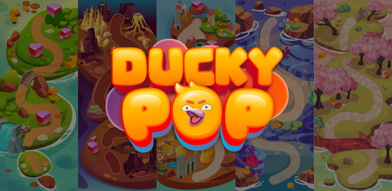
The Psychology Behind Match-3 Games: Why Ducky Pop is So Addictive
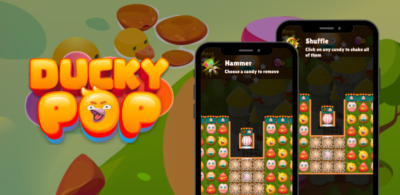
The Best Power-Ups and Boosters in Ducky Pop: When and How to Use Them
Tonework: The Future of Personalized Beauty is Here
Unlock the Hidden Worlds: Exploring the Different Themes and Levels in Ducky Pop
From Idea to Launch: A Step-by-Step Guide to Building Your Dream Startup
The Hydrogen Fuel Frontier: Aryanto Misel's Nikuba Tech Shakes the World
AI to the Rescue: Solving Urban Congestion with Smart Public Transportation
Ducky Pop: A Splash in the Match-3 Pool
Eye-Catching Profits: How Smart Design Turns Browsers into Buyers
The Digital Revolution: How Mobile Apps Have Transformed Our Daily Lives
The Future of Website Design: AI-Driven Tools Transforming User Experience
What Are the Most Challenging Obstacles in Ducky Pop and How to Overcome Them?
Ducky Pop: A Splash in the Match-3 Pool
The Rise of NFTs in the Industry: Revolutionizing Digital Assets and Innovation