

Feeding the Future: Tackling Global Food Security with AI Agriculture
07 Aug, 2024
- 11963 views


2016 - 2026 Copyright @ Graphie.
All Rights Reserved
Typography plays a crucial role in design, whether you're creating a logo, website, or printed material. The right font choices can elevate your work, while poor typography can confuse or alienate your audience. Follow these expert tips to master the art of typography and impress every viewer.
Konsultasi GRATIS tanpa Komitmen, dan wujudkan visual yang menjual.
CHAT SEKARANGFonts fall into several major categories: serif, sans serif, script, and display. Each type serves a unique purpose. For instance, serif fonts convey tradition and professionalism, while sans serif fonts are clean and modern. Knowing when to use each type is the foundation of good typography.
Using too many fonts can overwhelm your design. Stick to two or three complementary fonts. Pairing a bold sans serif for headings with a subtle serif for body text creates a balanced look. Tools like font pairing guides can help you find perfect matches.
Hierarchy directs the reader's attention. Use size, weight, and spacing to distinguish headlines, subheadings, and body text. For example, a large, bold headline grabs attention, while smaller, lighter body text ensures readability.
Kerning adjusts the spacing between letters, and leading controls the space between lines. Properly spaced text is easier to read and visually pleasing. Adjust kerning for tight or loose lettering and experiment with leading to ensure text flows well.
No matter how stylish a font looks, readability should always come first. Avoid overly decorative fonts for long passages of text. Instead, opt for clean, simple fonts like sans serif or well-designed serif fonts that ensure easy reading.
Typography sets the tone for your design. A playful script font suits invitations or creative projects, while a formal serif font is better for legal documents. Ensure your font choice aligns with your message.
Contrast makes your typography stand out. Combine thick and thin fonts, light and dark colors, or large and small sizes. High contrast creates visual interest, but avoid going overboard, as it can become distracting.
Always test your typography in real-world scenarios. View your designs on different devices, resolutions, or print formats to ensure the text looks great everywhere. Minor adjustments can make a significant difference.
Mastering typography is both an art and a science. By understanding font categories, limiting font choices, and ensuring readability, you can create designs that captivate and inspire. Whether you're designing a sleek website or crafting a timeless logo, thoughtful typography will always leave a lasting impression.


Recommended for you
Feeding the Future: Tackling Global Food Security with AI Agriculture
The Psychology Behind Match-3 Games: Why Ducky Pop is So Addictive
The Best Power-Ups and Boosters in Ducky Pop: When and How to Use Them
Tonework: The Future of Personalized Beauty is Here
Unlock the Hidden Worlds: Exploring the Different Themes and Levels in Ducky Pop
From Idea to Launch: A Step-by-Step Guide to Building Your Dream Startup
The Hydrogen Fuel Frontier: Aryanto Misel's Nikuba Tech Shakes the World
AI to the Rescue: Solving Urban Congestion with Smart Public Transportation
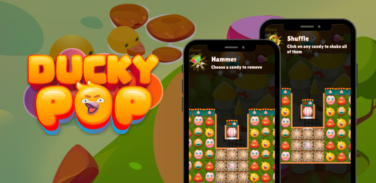
Ducky Pop: A Splash in the Match-3 Pool
Eye-Catching Profits: How Smart Design Turns Browsers into Buyers
The Digital Revolution: How Mobile Apps Have Transformed Our Daily Lives
The Future of Website Design: AI-Driven Tools Transforming User Experience
What Are the Most Challenging Obstacles in Ducky Pop and How to Overcome Them?
Ducky Pop: A Splash in the Match-3 Pool
The Rise of NFTs in the Industry: Revolutionizing Digital Assets and Innovation